Why Your Website Must Be Responsive in 2025
Mobile-First Indexing: The Ultimate Guide to Responsive Design in 2025
Introduction The era of “desktop-first” is officially over. Today, over 60% of global web traffic originates from mobile devices. In response to this seismic shift, Google has fully transitioned to Mobile-First Indexing. This means that Google predominantly uses the mobile version of your content for indexing and ranking. In 2025, having a mobile-friendly website is not just a “feature”—it is the baseline requirement for online visibility. If your website does not perform flawlessly on a smartphone, it is practically invisible to search engines, regardless of how beautiful it looks on a laptop. At AMA IT Solutions, we adopt a mobile-first philosophy, ensuring that your digital presence is robust, fast, and intuitive on every screen size.
1. What is Responsive Web Design (RWD)?
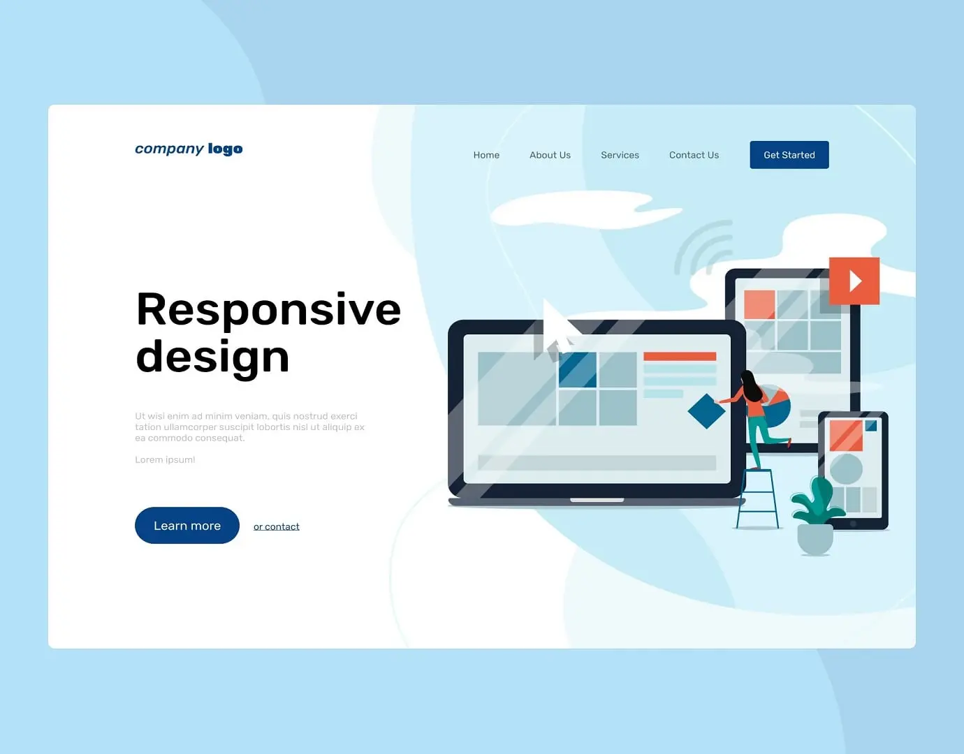
Responsive Web Design is an architectural approach where a website’s layout automatically adjusts to the size of the screen it is being viewed on.
Fluid Grids: Instead of using fixed pixels (e.g., a 1000px wide container), responsive design uses percentages. This allows content to “flow” like water into the container of the device, whether it’s a 6-inch phone or a 27-inch monitor.
Flexible Images: Images are coded to scale within their containing elements, preventing them from overflowing or breaking the layout on smaller screens.
Media Queries: These are CSS filters that apply different styles based on the device’s characteristics (e.g., “If the screen is smaller than 768px, hide the sidebar and show a hamburger menu”).
Understanding Google’s Mobile-First Indexing
Many business owners misunderstand this concept. “Mobile-First” does not mean “Mobile-Only.” However, it does mean that Google crawls the mobile version of your site before the desktop version.
Content Parity: If your desktop site has 1000 words of valuable content but your mobile site hides 500 words to “save space,” Google will only index the 500 words visible on mobile. You will lose rankings for the hidden keywords.
Structured Data: Schema markup (code that helps Google understand your content) must be present on the mobile version, not just the desktop.

The Core Elements of High-Quality Mobile UX
Designing for mobile is more difficult than desktop because you have less space to capture the user’s attention. At AMA IT, we focus on the “Thumb Zone” and ease of use.
The Core Elements of High-Quality Mobile UX
Designing for mobile is more difficult than desktop because you have less space to capture the user’s attention. At AMA IT, we focus on the “Thumb Zone” and ease of use.
1. Touch Target Size Have you ever tried to click a tiny link on a phone and accidentally clicked the wrong one? That is a UX failure.
The Standard: Interactive elements (buttons, links) should be at least 44×44 pixels. This ensures that users with larger fingers can navigate comfortably without frustration.
2. Readable Typography Reading on a small, vertical screen requires different font settings.
Scaling: We ensure base font sizes are at least 16px to prevent users from needing to “pinch and zoom” just to read your service descriptions.
Line Height: Adequate spacing between lines prevents text from looking like a wall of bricks, improving readability and time-on-site metrics.
3. Navigation Design Complex mega-menus work on desktops but fail on mobile.
The Hamburger Menu: We utilize clean, expandable menus that keep the header uncluttered.
Sticky CTAs: Key actions like “Call Now” or “Get a Quote” should often remain visible at the bottom of the screen as the user scrolls.
Common Mobile SEO Mistakes to Avoid
Even modern websites can suffer from technical flaws that hurt mobile rankings.
Intrusive Interstitials: Google penalizes sites that show giant pop-ups covering the main content immediately after a user lands on the page.
Blocked Resources: In the past, developers blocked Googlebot from accessing CSS/JS files to save bandwidth. Today, Google needs to render the page fully to check if it is mobile-friendly. Blocking these files hurts your SEO.
Slow Mobile Speed: Mobile networks (4G/5G) can be unstable. Heavy images that load fast on office WiFi might take 10 seconds on a mobile data plan, causing high bounce rates.
Adapt or Disappear
The user journey in 2025 often starts on a smartphone during a commute and ends on a laptop at the office. If you fail the first step—the mobile experience—you lose the customer before they even arrive. Is your website truly responsive? Contact AMA IT today for a mobile compatibility audit and let us build a site that fits every customer, everywhere.


